


How Would You Describe a Histogram?
A histogram is a graphical representation in the form of bars that symbolizes the distribution of a set of data. They serve to obtain a "first glance" overview, or panorama, of the distribution of the population, or of the sample, with respect to a quantitative and continuous characteristic.
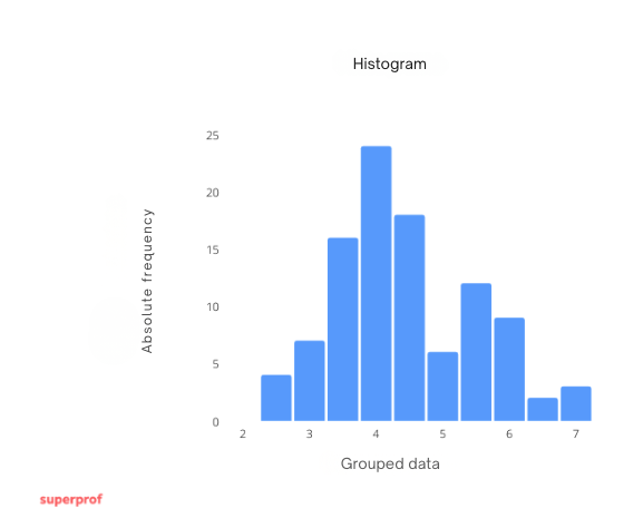
In a histogram, the axis of  (or abscissas) consists of the range in which the data is found. Now, the bases of the rectangles consist of the intervals in which we group this data.
On the other hand, on the axis of  (or ordinates) we have more options. Depending on these options is the type of histogram we have. The two main types of histograms are the following:
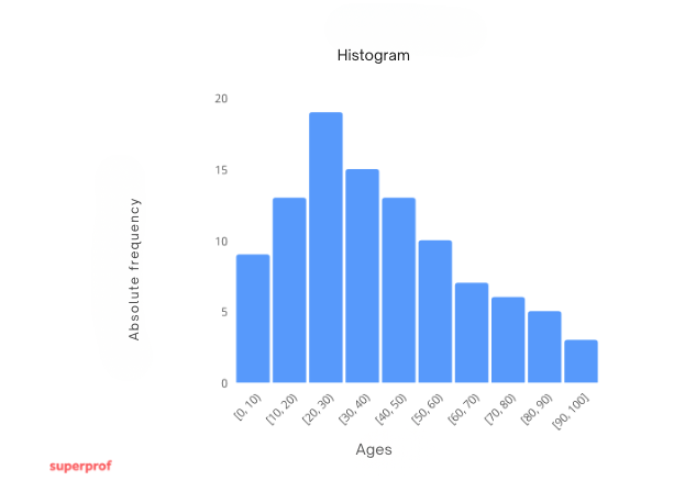
- Histogram of absolute frequencies. Represents the absolute frequency through the height of the bars.
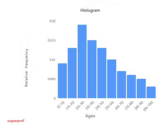
- Histogram of relative frequencies. Represents the relative frequency through the height of the bars.
Thus, since we now know the characteristics of a histogram, we have that to construct one, given a set of data, we must follow the following steps:
- We draw the axis of abscissas in such a way that it includes at least the range of the data and, subsequently, we divide this range into the given intervals.
- We draw the axis of ordinates representing the absolute or relative frequencies as appropriate.
- We draw rectangles of width equal and proportional to the interval (in our case, all will have the same width) and of height equal to the absolute or relative frequency, as appropriate.
Example. Let us consider the following data
| Age | Persons |
|---|---|
 | 9 |
 | 13 |
 | 19 |
 | 15 |
 | 13 |
 | 10 |
 | 7 |
 | 6 |
 | 5 |
 | 3 |
| Total: | 100 |
Our histogram of absolute frequencies would be the following
On the other hand, our histogram of relative frequencies would be the following
Frequency Polygon
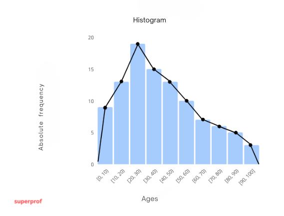
A frequency polygon gives the same information as a histogram. To do this, we graph a point for each class of the data set where the x-axis value is taken as the midpoint of the class and the y-axis ordinates have the same value as the height of the rectangle. Finally, we connect each point with its successor and its predecessor.
Example. Using the same data set from the previous example
| Age | Persons( ) ) | Acumulated frequency ( ) ) |  |
|---|---|---|---|
| 9 | 9 | 5 |
| 13 | 22 | 15 |
| 19 | 41 | 25 |
| 15 | 56 | 35 |
| 13 | 69 | 45 |
| 10 | 79 | 55 |
| 7 | 86 | 65 |
| 6 | 92 | 75 |
| 5 | 97 | 85 |
| 3 | 100 | 95 |
| Total: | 100 |
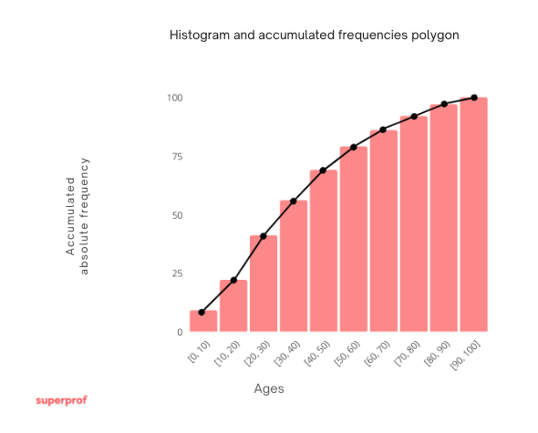
Histogram and Cumulative Frequency Polygon
If the cumulative frequencies of a grouped data table are represented, a histogram of cumulative frequencies and its corresponding polygon are obtained.
Example. Using the same data set from the previous example
| Age | Persons() | Acumulated frequency () | |
|---|---|---|---|
| 9 | 9 | 5 |
| 13 | 22 | 15 |
| 19 | 41 | 25 |
| 15 | 56 | 35 |
| 13 | 69 | 45 |
| 10 | 79 | 55 |
| 7 | 86 | 65 |
| 6 | 92 | 75 |
| 5 | 97 | 85 |
| 3 | 100 | 95 |
| Total: | 100 |
Histograms with Different Interval Widths
In this case, the histogram should represent the frequency of each interval with the area of the bar and not with its height. Therefore, we calculate the height of each bar in the following way:

Where:
 is the height of the interval
- is the absolute or relative frequency of the interval, as appropriate.
 is the width of the interval
The idea of the frequency polygon remains exactly the same.
Example. Let us consider a different grouping of the data from the previous examples:
| Age | | Persons () | Relative frequency ( ) ) | Relative |
|---|---|---|---|---|
| 5 | 9 | 0.09 | 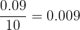 |
| 15 | 13 | 0.13 | 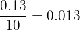 |
| 25 | 19 | 0.19 | 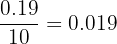 |
 | 45 | 38 | 0.38 | 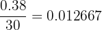 |
| 65 | 7 | 0.07 | 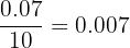 |
| 75 | 6 | 0.06 | 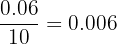 |
| 85 | 5 | 0.05 | 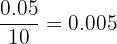 |
| 95 | 3 | 0.03 | 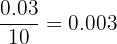 |
| Total: | 100 | 1 |
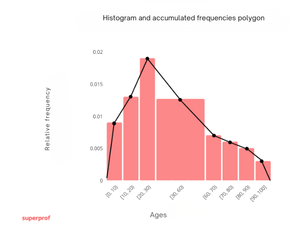
Its histogram and relative frequency polygon would be the following
Summarize with AI:
Did you like this article? Rate it!

 Loading...